case study | gradient exploration .01
cracked
the goal
To create an identity for a hypothetical device that emphasizes the high dynamic range of modern screen technology through the subtle complexity of gradients captured in the real world.
motion exploration
I believe most of my successes in the creative field have arisen at the crossroads between happy accidents and preparation. Introducing randomness to the equation is one method I focused on for creating an environment to capture those moments when they happen. Using RGB LEDs bricks and light bars to illuminate stress fractures in acrylic, I could move around the space to create truly random combinations of colors and gradients. Once created, the happy accidents just needed to be captured, and video served a dual purpose by also allowing me to concept transitions between light and dark modes, lock screen animations, screen on and off animations, etc. with the same footage.
mobile users use landscape mode or click here to view the above video
Red
the detail in the veining of the fracture pattern
gold highlight feels surreal, like the material itself transformed
subtle shimmers and waves could be useful for parallax animations
Blue
moments feel like the object is light, instead of just coming through it
light moves organically, feels like electricity
shiny flat surface betrays the true shape
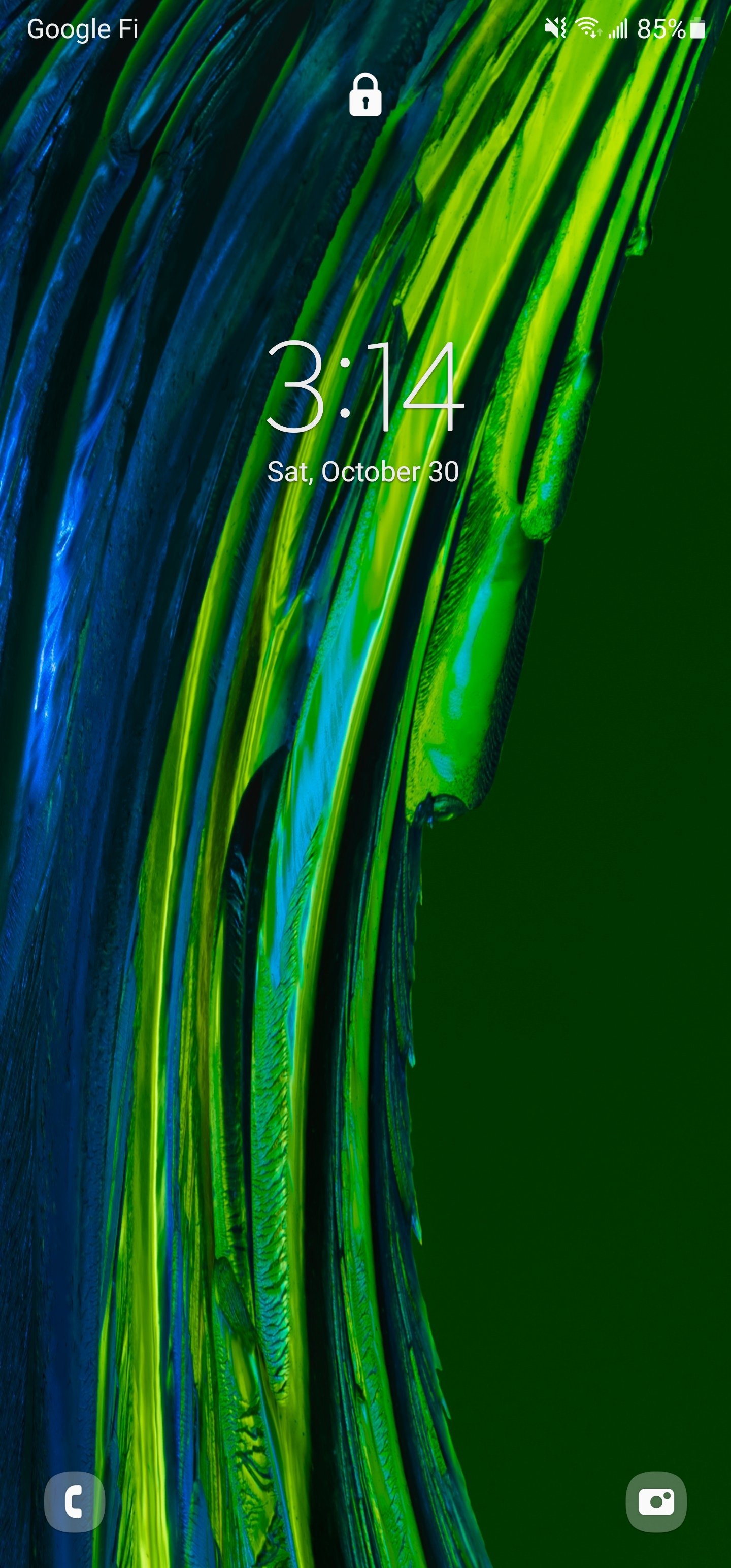
Green
deep contrast between highlights and shadows created in the shape
fantastic “power down” movement towards the tip of the shape
subtle engagement with rear piece
Silver
balancing colors across the color wheel helps keep the overall feeling neutral
great balance between smooth surfaces and rough, and between flowing and jagged shapes
neutral tone doesn’t have to mean strictly black and white
hardware wallpapers
Combining everything I learned in the motion process, I set forward to create the identity assets that would be shared across all uses.
Single framing sharing 4 lighting scenarios
motion assets should focus on variance in the movement of light and transitions between light and dark, as well as transitions between color versions
Build based on a system, surprise the system
Start with the under glow color, build background gradient to compliment, fill in with adjacent color
Blue asset stands out because the adjacent color is one that was already used as the fill for red, so the decision was made to skip over a little to focus on orange/yellow
Focus stack to maintain sharpness throughout
hard to choose
One of the more difficult aspects of this creatively has been choosing a final crop. The way the light interacts with the structure differently in every part of the image, almost any crop can produce a compelling result. I test drove each wallpaper on my personal phone and found something to love in each iteration.
Advertisements
Illuminated gradients blending
Digital billboards would respond especially well to the pulsing of the color glows
JFK Terminal 4
Toronto
Harajuku
what worked
Video good
The sheer speed with which the discovery process happens on video is astounding. An hour of footage is weeks worth of shooting stills.
Random good
Organic structure of stress fractures provides fantastic randomness.
Color combos
Silver light mode brings a lot of subtlety in color variation.
Red dark mode has an extremely bold contrast between the under glow and dim top light. The red looks like it’s made of energy.
Green is very soothing, even with the almost radioactive glow in dark mode.
Blue has the most dramatic and surprising combination of the bunch.
what didn’t
Flat asset
Still asset could have used some more depth, possible through interaction with another piece of acrylic in the background to fill the empty space.
Too controlled
Surprise the system more, reintroduce a little more of the chaos from the motion explorations.


